Repositioning of M30
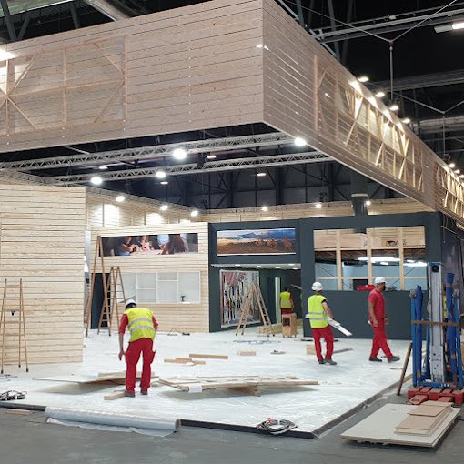
M30 is one of the most important stand construction companies in Spain with more than 35 years of experience. With the change of ownership, the company commissioned a consultancy to revamp the brand. In collaboration with Nomon design we accompanied the new owners to look back over the past, to redefine itself to best take advantage of the opportunities of the post-Covid era.
Graphic design:
Nomon design
Team
Services
Client
Before
After
We analyzed the company's product and service offerings by taking a good look at the projects commissioned, customer history, trade fairs attended and referral channels. In this process, we detected a missed opportunity. One thing the company had been doing was the production of events and furniture for stores and restaurants. This area was ripe for expansion and with a little bit of extra focus and communication it has become a larger, solidified business area.
the tagline
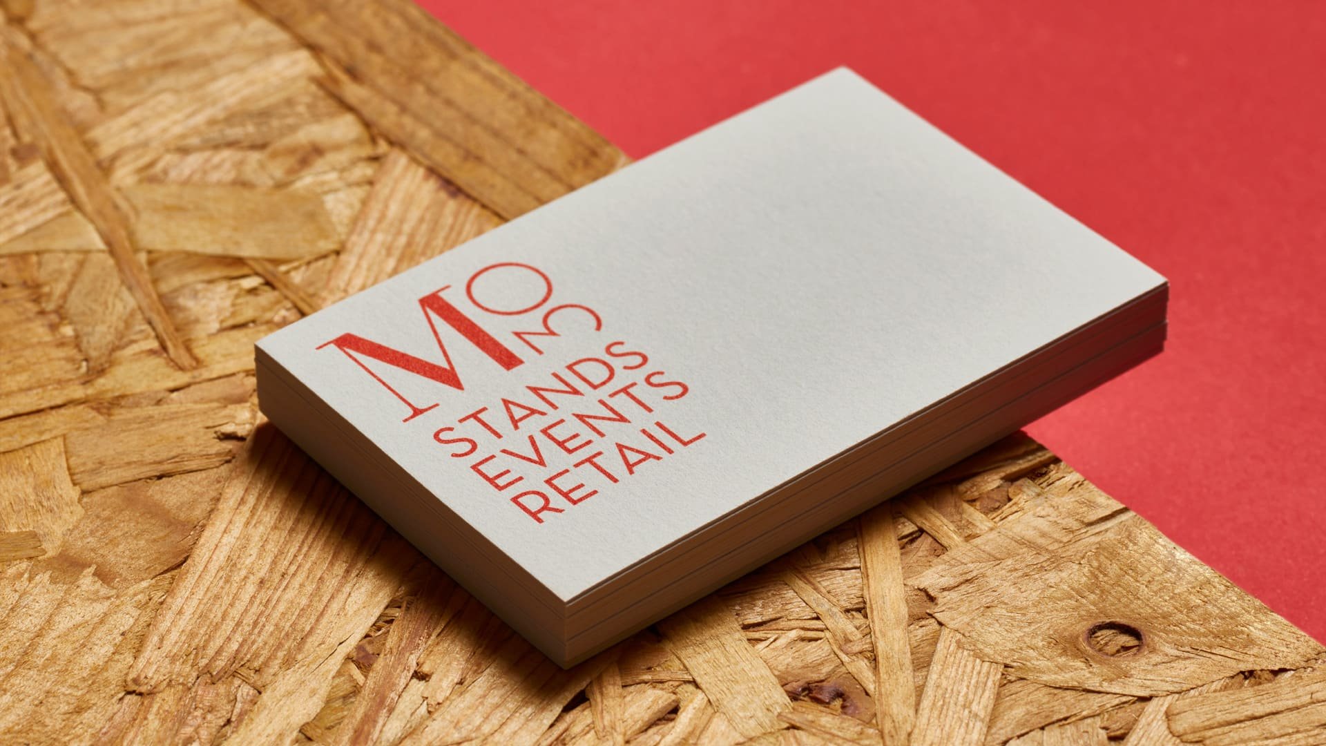
To communicate this new business area, we reviewed and redefined M30's new positioning, focusing on creativity with a generalist approach and we proposed the tagline "stands, events, retail".
New brand image
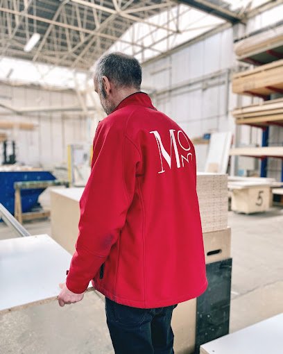
Such a shift needed to be reflected in the brand image. Nomon design was in charge of redefining its corporate identity to reflect both its past (experience and trajectory) and its new vision for the future (new direction) while maintaining the red and white, so representative of the brand. The corporate identity manual was developed, applying the new branding to communication materials, stationery, uniforms, merchandising, transportation, etc.


